

SONG: WHAT WONDERFUL GRACE
BY Ken Blue
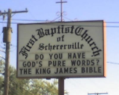
A church sign reflect who we are, and the kind of people we are trying to attract. Therefore, it should be clean, easily read, and interesting. It is the church advertisement. Bad advertisement is worse than none at all. I looked on the web for “stupid church signs,” and could not believe my eyes. The above is not the worst one, but one glance and you can see what is wrong. I’m sure the lost will flock to find out just what it means.
Seriously, we need to get the lost inside the church, get them saved, and then begin the teaching process. If someone comes in with a Sears Catalogue, we should be thankful they are there. If we can get them saved, in time, they will trade the catalogue for the Bible.
The name of the church should be bold and in clear font. The hours should also be easily read by those who drive by. If your sign will permit you to post your sermon title, it should be clear and interesting.
Personally, I would not put the following on a sign: Independent, Fundamental, Premillennial, King James Version, Dispensational, and Old Fashion. It is proper and right to hold these convictions, but those words have no meaning to unbelievers, and will send them down the road. Many Christians don’t even understand their meaning.
If you are trying to reach the unreached, make your sign simple and interesting. Now, if your church is not trying to attract sinner, you could write everything in the original Greek. Perhaps an original Greek will drive by and you will snare him. You will get what you go after.


Pastor Ken Blue was born in Boswell, Ark. In 1955 he accepted Christ as his Savior. He and his wife Joyce were married in 1955. They have 5 children. He graduated from Midwestern Baptist Bible College in 1969 and started the Open Door Baptist Church in Lynnwood, Wa. where he pastored for 39 years. Because of health issues (ALS) he was forced to resign as pastor. It is his desire to continue to be used of God to help pastors and believers through this ministry.